
Cool header Text Ideas
Are you tired of boring header text? Here are 4 unique ways to customize your website’s header texts that won’t break your brain.
These codes work best with graphic Sans Serif fonts, but you do you! Don’t let me stop you.

These css codes works with all 7.1 and 7.0 template families.
Head to Design > Custom CSS and inject the code you like below.
Animated header text using any Gif
This customization is a great way to animate your headers in a fun way. Use any gif URL to fill the text area on hover. This customization feature works best on bold fonts.
Copy and paste this code to Custom CSS
// Hover GIF Text //
h1:hover {
  background: url(GIF-URL-HERE.gif);
  background-size: 200%;
  background-position: center;
  -webkit-background-clip: text;
  color: transparent;}
// Hover GIF Text //
Customize the Code
Change the h1 to the header you’d like to target: h1, h2, h3, or h4.
Add in your animated GIF by replacing GIF-URL-HERE.gif with your own link (make sure the URL link ends in .gif).

Outline Header text when bold
Super easy text effect. When you bold the header, the text will become transparent and outlined.
Customize the Code
Change the h1 to the header you’d like to target: h1, h2, h3, or h4. You can remove strong to target all headers instead of just bolded headers.
-webkit-text-stroke-width: .5px; (Line thickmess)
-webkit-text-stroke-color: #000; (Line Color)
-webkit-text-fill-color: transparent; (Text Fill Color, replace with a Hex Code to fill in text)
Copy and paste this code to Custom CSS
// Text Outline Effect //
h1 strong {
-webkit-text-stroke-width: .5px;
-webkit-text-stroke-color: #000;
-webkit-text-fill-color: transparent;}
// Text Outline Effect //
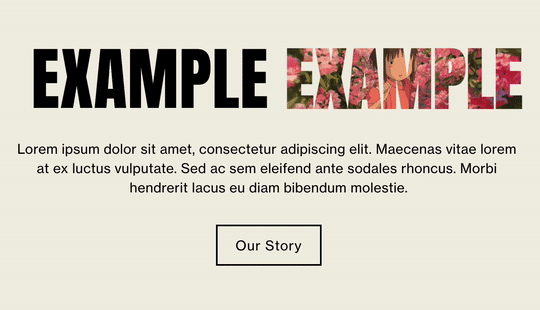
Image overlay on header
This is a fun way to liven up your headers. By bolding the header of your choice, an image will overlay on the text.
Copy and paste this code to Custom CSS
// Image Header Overlay//
h1 strong {
  background: url(IMAGE-URL-HERE) no-repeat center center;
  background-size: cover;
  color: #fff;
  -webkit-text-fill-color: transparent;
  -webkit-background-clip: text;}
// Image Header Overlay//
Customize the Code
Change the h1 to the header you’d like to target: h1, h2, h3, or h4. You can remove strong to target all headers instead of just bolded headers.
Add in your image by replacing IMAGE-URL-HERE with your own link. I suggest uploading the image file to your Manage Custom Files portal in your Custom CSS Editor. When you do this, Squarespace will generate a link for you to use.
Okay, this one might break your brian…but I believe in you!

Gradient header
You can either use the full code to animate your gradient header using the keyframes or just use the top section without the Keyframes for a simple gradient effect, both options are fun!
Customize the Code
Change the h1 to the header you’d like to target: h1, h2, h3, or h4.
Gradient color section:
Update background-image: linear-gradient Hex codes to anything you’d like
For gradient ideas, visit uiGradients for color combinations and patterns.
For more gradient effect ideas, check out this post “Highlighted Text With Animated Gradient“.
Omit // Animation Keyframes // section if you want a still gradient Do not change the values of the Animation Keyframes.
Copy and paste this code to Custom CSS
// Animated Gradient Header Font Start //
h1 {
  background-image: linear-gradient(-45deg, #cc2b5e, #555bed, #FF0099, #f56a4c) !important;
  background-size: 400% !important;
  background-clip: text;
  -webkit-background-clip: text;
  text-fill-color: transparent;
  -webkit-text-fill-color: transparent;
  -webkit-animation: Gradient 6s ease infinite !important;
  -moz-animation: Gradient 6s ease infinite !important;
  animation: Gradient 6s ease infinite !important;}
// Animated Gradient Header Font End //

// Animation Keyframes //
@-webkit-keyframes Gradient {
  0%{background-position:0% 50%}
  50%{background-position:100% 50%}
  100%{background-position:0% 50%}}

@-moz-keyframes Gradient {
  0%{background-position:0% 50%}
  50%{background-position:100% 50%}
  100%{background-position:0% 50%}}

@keyframes Gradient {
  0%{background-position:0% 50%}
  50%{background-position:100% 50%}
  100%{background-position:0% 50%}}
// Animation Keyframes //
Quick Tip
If you’d like to target a specific block’s Header, add the block ID before the Header code of your choice (h1, h2, h3, h4).
Pro Tip- Download a browser extension to easily find your Collection/Block ID, these are a few or search “Squarespace collection/block identifier“ in a search engine.
That’s it!
Reach out in the comments if you have any questions.
Disclaimer: Nestingzone is not affiliated or endorsed by Squarespace, we just love their platform. Nestingzone x Weihaasome is not responsible for any changes you make to your website’s code. CSS knowledge is required in order to be able to implement the above CSS suggestions.